All content is automatically translated
The first release of Q.wiki 6 is here! Starting with this release, we will publish Q.wiki 6 in several releases over the coming weeks. This approach will allow us to spread out a major transition, respond to unforeseen issues quickly and in a targeted way, and give you as smooth a transition as possible. With this first part, we will revamp the user interface around discussions and embed the new more intuitive term proposed change in the software.
From discussion to proposed change
The foundation of Q.wiki is to be as easy to use as possible. In addition to the design of the software, the comprehensibility of the terms is crucial for this. However, the term "discussion" in the course of the central function of the release workflow repeatedly leads to confusion. If a user wants to change something, he does not expect to have to "open a discussion". After all, he often does not want to discuss, but to propose a change. For this reason, discussion in Q.wiki is now called "Propose Change"!
But we don't stop with the terms. We have also made major improvements to the user interface, making Q.wiki easier to use and more intuitive and self-explanatory, especially for new users. The switch between the released status and the proposed changes has been improved for this purpose. One of the most common stumbling blocks for new users is looking for the "Edit" button because they are not aware that they are in the shared state. Instead of using tabs far away from other controls on the page at the top left, a new button has been added at the top right: directly next to the other controls. If the "Edit" button is missing, it is immediately clear why. In addition, we now also show the released status more clearly by means of a green note next to the title, analogous to the yellow note in the proposed change. The user thus knows immediately where he is at the moment.

New button "Proposed change"
We have continued this alignment and improvement of the controls in the edit mode. The edit bar is now single-line and has been thematically reorganized and grouped. The controls for saving, discarding and caching have been removed from the edit bar and also moved consistently to the top right. In addition, the edit mode is now automatically maximized with the first click in the content. The extra maximize button is no longer necessary.

Single-line, uncluttered editing bar
Further improvements
-
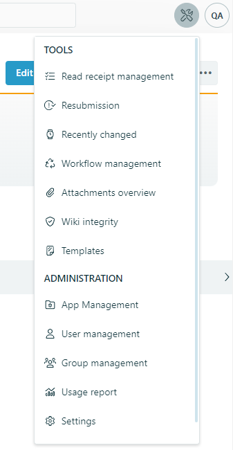
The left navigation bar has been tidied up. All functions that are administrative have been moved to the new tool menu at the top right.

New tool menu in Q.wiki
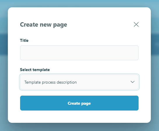
- The dialogue for creating new subordinate pages has been revised and made clearer.

New page creation dialog
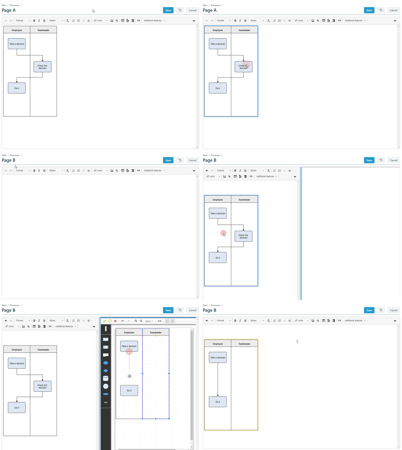
- The flowchart editor has been integrated into the normal editing mode.
- Flowcharts can now be copied. To do this, select any flowchart in the edit mode of a page, copy it and paste it in another edit mode.

New flowchart editor with copy option
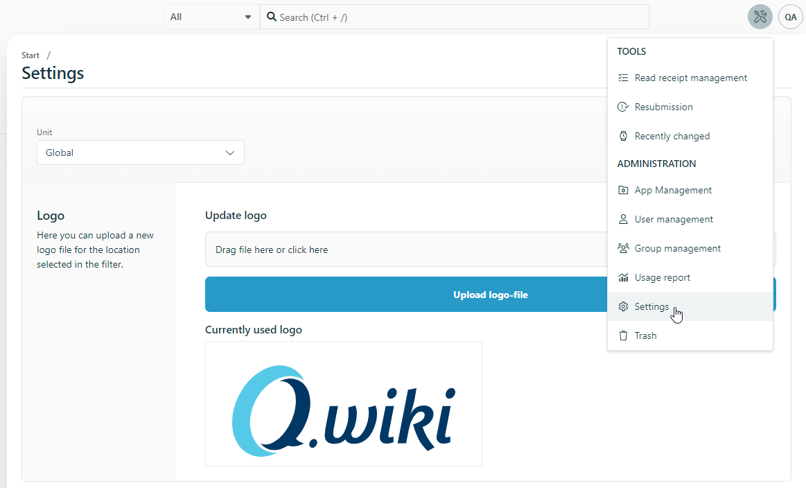
- With the logo we take the first step towards an interface for Q.wiki settings. There, key users can update the logo quickly and easily.

New Q.wiki settings
- Security-critical file formats can no longer be opened directly in the browser, while this is possible again for harmless as well as common file formats starting with .pdf, .png as well as .jpg.
Bug fixes
- Images in templates are copied again when the template is used.
- Using the undo function (Ctrl+Z) of the edit mode no longer resets images to their original size.
- Risks from a global risk app, if linked, are now also correctly displayed on local sites of a location.
- Files with a file size between 80MB and 100MB can be uploaded again.
- Links to shapes in the flowchart can again be added using auto-completion and no longer require manual copying of the URL.
- Deleting a complete organizational unit in Q.wiki now reliably deletes all subsections of the unit as well.
- By clicking on the Q.wiki logo, users are now reliably redirected to the process landscape of the organizational unit and no longer to the portal.
- Groups created with the new group management are also found in selection fields.
- In page histories, the images that were available at the time of the history are displayed again.
- In the page history, it is always possible to filter for approved statuses.
Discontinuations
- New pages can no longer be created via dead links on image maps/images. Instead, the required pages must now be created in advance and then linked via the image map on the image. This discontinuation results from the revisions in the user interface.
Additional improvements Q.wiki 6.0.4
- The InternalAdminUser is now called Q.wiki Admin and thus becomes more traceable in the history.
- The notification mail for read receipts has been revised and is now sent bilingually in German and English.
- Access to the usage report can now be extended to users outside the KeyUserGroup via the new group "ReportingGroup". The new ReportingGroup can be found by key users in the group management.
- The table of contents is no longer overlaid by the Q.wiki header.
- The table of contents is no longer displayed in the version comparison.
Additional improvements Q.wiki 6.0.7
- When creating a new page, the current user is now automatically set as the page owner.
- Multisite: Global templates can be created again.
- Risks can be edited reliably again.
- When adding links, the areas in the area selection no longer duplicate.
- Error messages now always display the display name instead of the user's identification number.
Additional improvements Q.wiki 6.0.10
- Selection fields can be used again in the Employees app.
- The page history of the three-point menu and the small history at the bottom of the page now always match.
- Adding a comment is now always noted in the history as editing the page.
- Opening tools from edit mode no longer results in incorrect display.